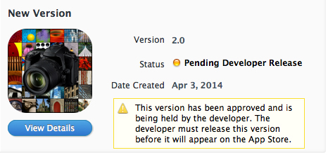
As my “newb app developer” journey continues, I am still learning new things. As I prepare to launch V2.0 of my apps however, it has given me a chance to look back at where it all began, and how I’ve come to where I am at right now.
I really believe in the importance of self-reflection in everything you do. I think it’s critical to constantly evaluate your life, work, interests. Am I teaching this course the best way? Do I have the right life/work balance? Am I happy with the way things are?
Or in the app developer context, what can I do to improve my app even more? How can I get more downloads? Does the design needs tweaking?
I thought in this post I’d turn back the clock to November 2012 when I first launch my apps, to how they will look once V2.0 is unleashed!
DESIGN
No question. My original design sucked. Hard.
Best stated by this comment “it’s a great app, but it looks like a website from 1998…”
But that is what happens when you design things yourself instead of doing it right, AKA hiring a designer/UX specialist.
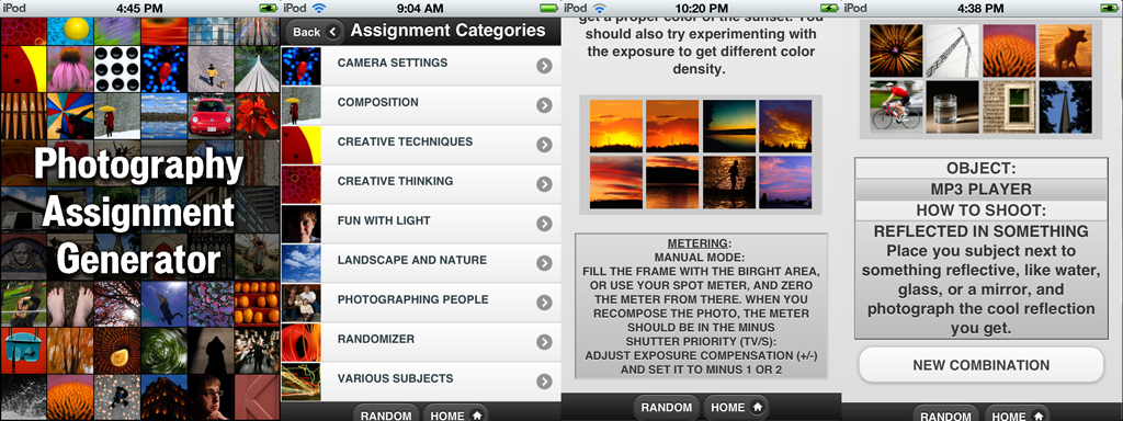
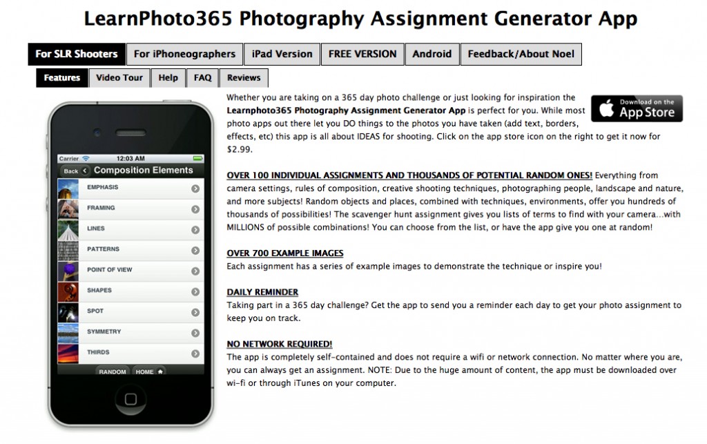
Lets compare where I started:
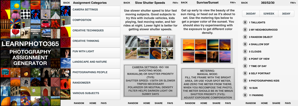
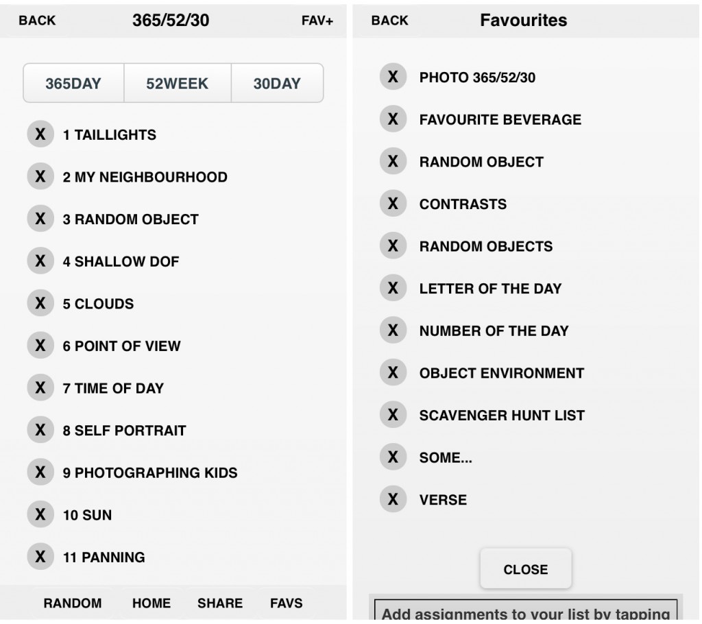
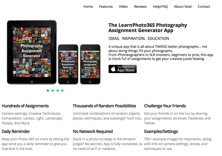
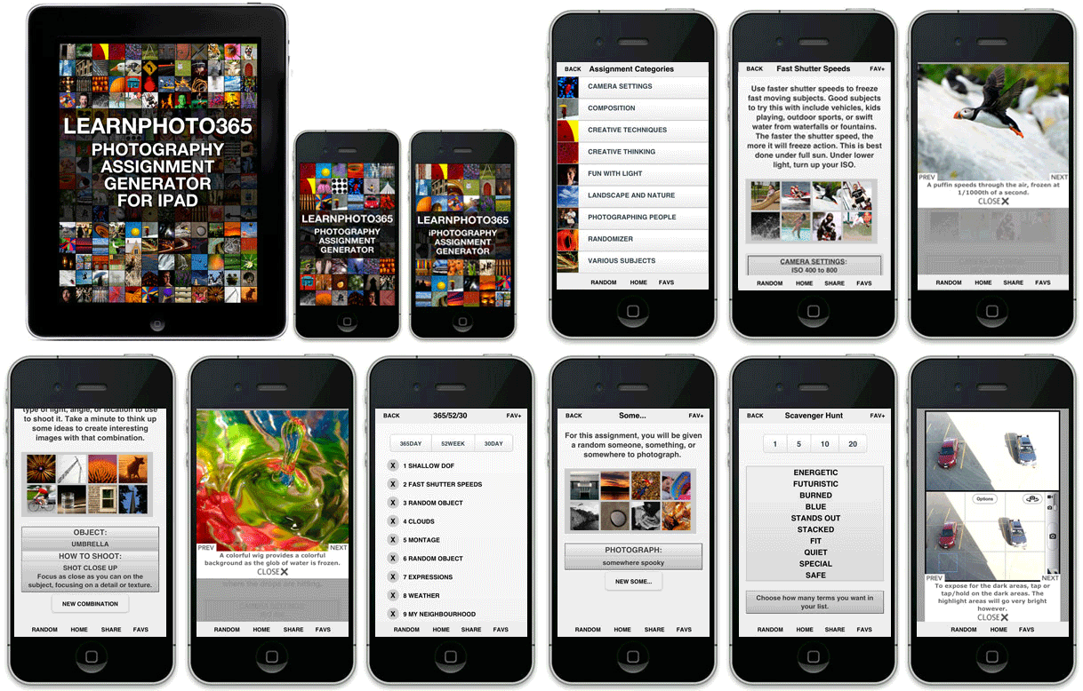
To now:
Obviously an improvement.
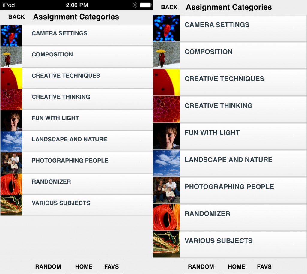
THEN: When I started, I was just working with the basic phonegap design, going with what “worked”. Except it didn’t really “work”. As you can see, footers weren’t always at the bottom of the window, instead you’d have to scroll down if the content didn’t fit the window. So off to Google/Stackoverflow I went. I kept trying fixes to get them to do that, none of which worked. I tried upgrading to a new version of jquerymobile…and everything stopped working. So I had to just leave them as is. And of course, Apple then released iOS7, which was a radical change in design.The menus also wouldn’t fit the larger iPhone screen properly. It was designed to fit the 3.5″ screen, but ended up with extra space on the 4″.
TODAY: I was finally able to figure out that bad HTML tags were causing the new versions of jquery mobile to break everything. Removed the old tags, problem solved. Footers now fixed to the bottom and no scrolling!
Not to mention I cleaned up the design and made it fit more with the iOS7 flat look.
Was finally able to figure out the code to have it load a different style based on the screen size too!
FUNCTIONALITY
THEN: The app gave a list of assignment, grouped into various categories. You could choose from the list, or have the app pick a random one for you. Pretty basic stuff. The app had a daily reminder function, however it was complex to turn on and off, as you had to follow a bunch of steps, then completely relaunch the app to get it to take effect.
TODAY: Well, the app still gives you a list of assignments in various categories. You can still choose from the list or get a random one.
But there are some great new features added since first launch.
-PHOTO365/52/30 LISTS! Even with the reminder, a user still had to go into the app and pick an assignment. I received many emails asking for the ability to generate an actual list of assignments to complete. So after a ton of researching (again, Google/Stackoverflow, etc) I came across an amazing tutorial for creating a list style app using phoengap! After some trial and error to mold it to what I wanted, V2.0 will now allow the user to create a complete 365 day, 52 week, or 30 day challenge list! I’m really excited about this feature, I think people will love it.
-FAVOURITE ASSIGNMENTS! I realized quickly that people would probably go through all the assignments in the app, and after that, they would be more interested in the random style assignments (random object, letter of the day, random object/technique). So in V1.5, I added the ability to create a list of favourite assignments that could be accessed at any time.
-Also added in V1.5 was the ability to share your assignments via Facebook, Twitter, and e-mail. This was another common request from users, and one that I was able to implement. However, it’s not as functional as I’d like, and judging by the lack of mentions on Twitter, isn’t really being used much. It also appears the method I used for Facebook has been broken by Facebook somehow. (Hopefully will be fixed soon).
-The REMINDER is still a bunch of steps to follow, but I was able to make it so you just had to go back to the app instead of relaunching it completely. Might have a fix on that for the next update.
-I tweaked the random code so that it would be more likely to get one of the more random style assignments.
MARKETING
THEN: My app website was a disaster. Having 5 versions of the app is confusing enough, but my first web page just made it worse.
Look at all those tabs…and it wasn’t mobile friendly. AT ALL.
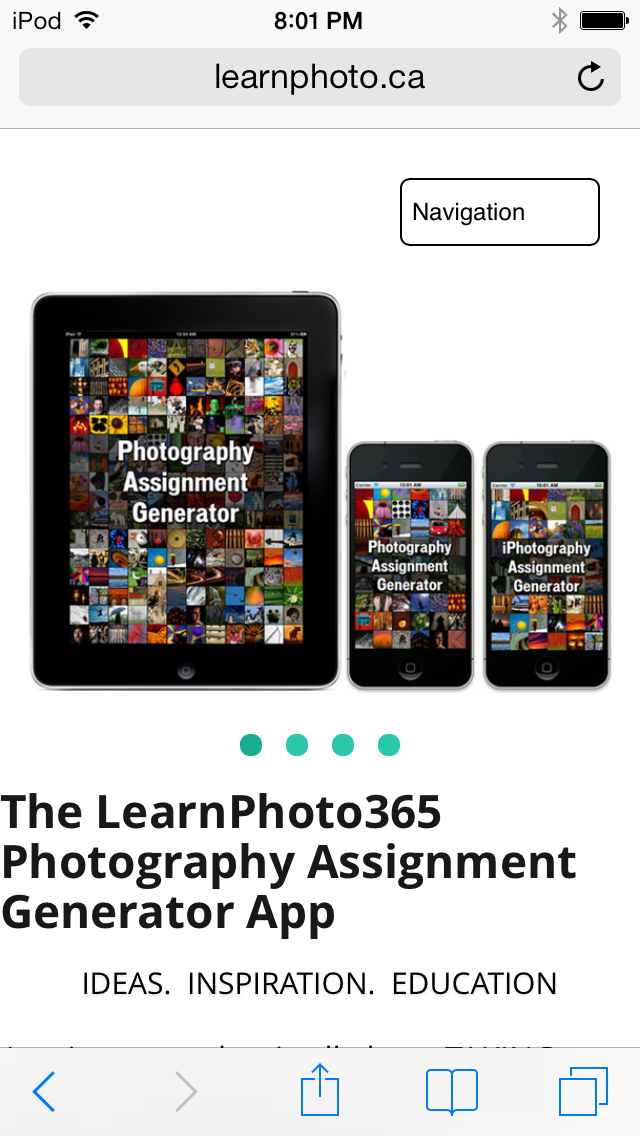
TODAY: Redesigned it, using a mobile-friendly template. Much cleaner, easier to navigate.
Seriously, don’t launch your MOBILE app without having a MOBILE website promoting your app. There are so many free templates out there, it’s really not that hard to have. Especially if you’ve hired someone to do your site.
I’ve also written at length on my social media suckery, so no need to go over all that again. But I’ve gotten better, and am happy to say I haven’t gotten banned or suspended from any social media or continents…
YET.
I am hoping for one more large marketing push when I release the updates, and would love to see some positive buzz and hopefully they will make their way back up the charts.
GOING FORWARD
Looking at the V2.0 final product…I really feel that this was how the app SHOULD have looked and functioned from day 1. I am planning another post where I will expand on the MVP (Minimal Viable Product) approach after the launch of V2.0, but there is no question this new version is a huge upgrade in design and functionality.
Here’s hoping V2.0 can get this graph going back up!
UPDATE: Here’s how it went: V2.0 Update Recap!
Noel
Help out a fellow developer! Download the free versions of my Photography Assignment Generator Apps and let me know what you think!
If you want to keep updated on my newb app developer adventures, subscribe to the blog by clicking on the subscribe page at the top or in the sidebar on the right!
———————-
Photographer and teacher
LEARNPHOTO.CA, Noel’s online photography learning community!
NEW! Photography Assignment Generator Apps now available on the app store!
Noel’s Portfolio
Noel’s Photo Tips Blog
Student Gallery
Contact Noel
(732)


Noel, the concept from day 1 was great and I’m sure that the various iterations have resulted in an awesome V 2.0. I’ve recommended this app to friends and photo students alike and it’s great for those days when you just need more practice or can’t think what to shoot – this time.
Enjoyed your retrospective article!